Tuesday, August 23, 2005
1975: Jim Aparo

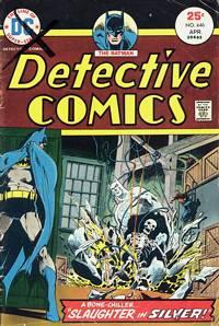
The recently deceased Jim Aparo is my all-time favorite superhero artist. Not coincidentally, he was also among my first--certainly the first whose particular style I noticed. He was introduced to me in early '75 (cover date April, but comics advance-dated by 3 months or so back then in order to get more time on the newsstands) via two Batman books: Detective Comics #446 and Brave and the Bold #118.
The former was part 3 of a 5-part storyline in Detective called "Bat-Murderer". That's a familiar title to current Batman readers, who bought a crossover event by the same name a couple of years ago--only given today's comics, it was something like a 26-part story crossing over into 6 or 7 different Bat-comics for the better part of a year. Of course I had no idea what was going on in the plot--Batman had been framed for a killing, and was tracking down clues to exonerate himself, leading him to "Silversmith", a new villain who wouldn't have been good enough for the 1960s Batman TV show--but that didn't matter. Aparo's art carried the book with deep shadows, heavy use of zip-a-tone shading and dynamic figure drawing that seemed to leap out of the page. It took years for me to realize that Aparo was working in a fairly close approximation of the art style of Neal Adams, who had revolutionized the look of Batman (and all of comics) a few years earlier with his more "realistic" portrayal of the human form, dramatic use of lighting, extreme perspectives and less restricted panel layouts. Well, for my money, while Adams gets all of the acclaim and $75 hardcover retrospectives, the self-professed "self-taught" Jim Aparo quietly took Adams' ideas and improved upon them. Adams' pages tend toward incoherence--each face, shoulder, power ring or whatever is expertly drawn in great detail, but there's rarely a sense of motion, life or connection between panels. Everybody looks like they're made of polished plastic. It's easy to see how Adams' glossy style could inspire a genration of of readers to become artists, but there's something unavoidably goony about his work that has always bothered me.
Aparo didn't suffer from that problem. His stuff looked just as great as Adams on the surface, but with more grit, and his characters moved more gracefully through more believable worlds. he even did his own lettering, a subtle thing, but one which gave his art a satisfying cohesiveness. I was terribly let down the following month when the "Bat-Murderer" story continued with the art of Ernie Chua--a 180º turn into some of the blandest art of the decade. Years later, I discovered Aparo's work on Phantom Stranger and the Spectre--two more characters he had inherited in part from Adams--and my appreciation only grew.
Luckily, Aparo was still on Brave & the Bold every month. But that's a love-letter for another time.
Comments:
<< Home
The funny part is that it was actually me that framed Batman for murder in 1975. I was a pretty precocious 4 year old.
Post a Comment
<< Home
